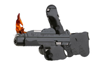
Final day of Photoshop. My Santa throwing a Christmas tree ornament.
Tuesday, December 20, 2011
Monday, December 19, 2011
12 Days of Photoshop: Day 11 (SOPA INFORMATION)
THIS BILL MUST NEVER PASS!!
For more information: http://en.wikipedia.org/wiki/SOPA
and
this will help explain: http://www.youtube.com/watch?v=JhwuXNv8fJM
Friday, December 16, 2011
Thursday, December 15, 2011
Wednesday, December 14, 2011
Tuesday, December 13, 2011
Monday, December 12, 2011
12 Days of Photoshop: Day 6
I think thsi worked rather well. It does have a nice motion blur effect I wanted, then creating multiple basketballs and chagning the opacity, the other side ended up looking rather nice.
Friday, December 9, 2011
12 Days of Photoshop: Day 5
Bit wierd, don't you think? I don't think I need to say antything else. Its looks bad because thats part of the art of it...
Thursday, December 8, 2011
12 Days of Photoshop: Day 4
Bit interesting don't you think. Hard project, simple to do, hard to make look good. I did my best, and its looks like paper mache. Not too bad, but definitly not my favorite project to work on.
Wednesday, December 7, 2011
12 Days of Photoshop: Day 3
Pretty happy with this one. Twisting Jaws into Paws was good fun. There is nothing I dislike about this poster. Overall, good amount of fun.
Tuesday, December 6, 2011
12 Days of Photoshop: Day 2
Behold!! My latest creation from Photoshop. I really wanted to give a Disney or a Pixar character lightning bolts, so who better than Jafar to recieve them. I thought this went really well, and I would love to do this again. Beware superheroes, there's a new villian on the market!!
Monday, December 5, 2011
12 Days of Photoshop: Day 1
I don't really like this one. I thought it would be easy, simple, and clever. In reality however, this turned out to be incredibly difficult and I don't believe I did that idead justice. The entire thing just looks unnatural, and the cut out does not work as well as I thought it would. However, any porject is better than no project. To me, this is a bit rushed.
Friday, December 2, 2011
Parts is Parts Platypus
FIrst project I've posted for a while. This one turned out nicely. I used a custom brush of pincushions, a picture of a pringle for the beack, a shell for the foot, and the earth for the eye. I even added a drop shadow, and a different background, and shaded different parts of the pltypus to add more contrast and make it more realistic. I'm very happy with how this turned out and I don't have any problems with it.
Subscribe to:
Comments (Atom)


